• Home
  • CSBDBOOK
  • DOMESTIKA
  • COACHING
  • NEWS
    • Websites
    • Campaign
    • Branding
    • MY CV.PDF
  • COLLABORATE
Menu

The Davis Group - The full range of creative business solutions

  • Home
  • CSBDBOOK
  • DOMESTIKA
  • COACHING
  • NEWS
  • Work
    • Websites
    • Campaign
    • Branding
    • MY CV.PDF
  • COLLABORATE

NEWS


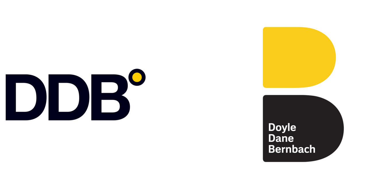
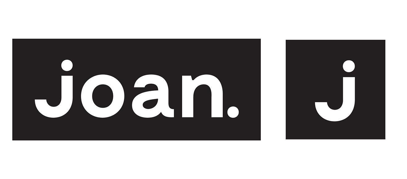
DDB's new logo (l.) and Joan's (r.) were both unveiled a week ago.

DDB's new logo (l.) and Joan's (r.) were both unveiled a week ago.

Design Experts Weigh In on DDB’s and Joan’s New Visual Identities Beauty remains firmly in the eye of the beholder By Lindsay Rittenhouse, Doug Zanger 3/29/19

March 29, 2019


AGENCIE
S DDB and Joan Creative (now just Joan) recently unveiled new visual identities for their 70th and third anniversaries, respectively.

We asked design experts in the industry to weigh in on both: like, love or just OK?

These are their unapologetically blunt takes:

DDB’s new logo pays homage to founders Ned Doyle, Mac Dane and Bill Bernbach, incorporating their names into the fresh visual which is essentially a revamped version of its very first one—two Ds, one yellow and one black, stacked on top of one …

DDB’s new logo pays homage to founders Ned Doyle, Mac Dane and Bill Bernbach, incorporating their names into the fresh visual which is essentially a revamped version of its very first one—two Ds, one yellow and one black, stacked on top of one another.

joan-old-logo-1320x581.jpg

Old Logo

Joan’s new identity, which coincides with the agency opening its new office at 44 Wall Street in late 2018, drops the “Creative” in its name and reimagines the lowercase, rounded typeface logo as an “impactful, edgier, uppercase word mark” with the …

Joan’s new identity, which coincides with the agency opening its new office at 44 Wall Street in late 2018, drops the “Creative” in its name and reimagines the lowercase, rounded typeface logo as an “impactful, edgier, uppercase word mark” with the “J” designed to represent Joan of Arc’s sword, CEO Lisa Clunie recently told Adweek.
Douglas Davis, Chair, BFA in Communication Design at New York City College of Technology

DDB: Loved it. “As a designer who broke into advertising, I remember walking into DDB’s offices on Madison Avenue wondering why the place looked like we were accountants. These were the days when an agency’s creative personality didn’t reach its own identity, interior design or website. So, I’m glad to see this design build on Bernbach’s respect for what a concept looked like. Then again, respect for visual problem solving makes sense when you’re partnered with Paul Rand. The perspective that combined the visual alongside the verbal changed advertising and is still influencing how we see the Ds make the B. That’s why the new logo is successful, it requires the viewer to see both the parts and the whole. It’s candy.”

Joan: It was OK. “I’m not a fan of Joan’s new look, but typographically speaking, they took risks I can respect. It’s risky in my view because it sacrifices the legibility of the J in exchange for the dagger application. And yet it’s better than the typeface they had, which felt too much like Jet, their client’s logo. All in all, typefaces go in and out of fashion, so this choice feels good for being noticed. Turned my head.”


Chris Do, president and founder of The Futur

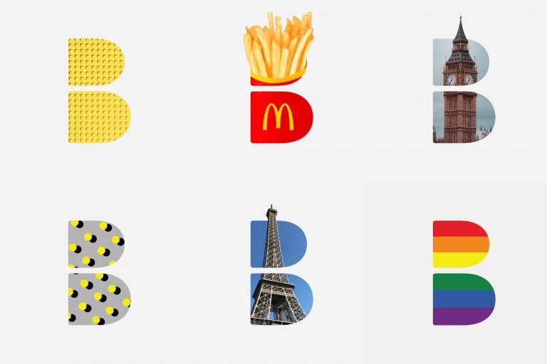
DDB: Liked it. “I think the rebrand is clever, bold and appropriate. It has a slightly nostalgic vibe to it but I think this was intentional to also reference the founders. I can see the mark being used in many ways where the previous mark couldn’t. It can be used as a graphic container, bug and repeating pattern.”

Joan: Didn’t like it. “I think there is something much more interesting about the simplicity to the original mark. It feels modern, quirky, friendly, personal, unpretentious. The new word mark feels over-designed and trying too hard to be symbolic.”


George Garrastegui, Jr., assistant professor/creative catalyst for NYC College of Technology

DDB: Liked it. “It is a clever form of the two Ds making up the counter of the larger B—similar in concept to the original logo, but it is in the application that it shines. Great fun is had within the shapes and the weight of the bottom black D grounds the logo. Overall the success of the mark relies too much on its application for me, but the nod to its historic beginning is a refreshing bet on themselves and not the competition.”

Joan: Loved it. “When I noticed the Joan Creative logo, it struck me as a fresh take on a brand. In comparison to its older version, it looks to move in the right direction. The previous logo, even though fun, it’s too similar to the jet brand. The update does away with the kitsch and takes a stab at achieving a memorable agency mark. This young brand now feels more mature and the usage of high contrast letterforms and a typewriter serif works harmoniously. This combination has a playful and modern twist that fits the style of work Joan focuses on.”

ddb-new-logo.png
the-joans-1320x660.jpg
ddb_logo_as_window-768x512.jpg
In Interviews, News
← Creative Strategy and the Business of DesignThis Design Life and the UK Creative Community ask Douglas and 22 others How Important is Design in 2019? →

Categories

  • Articles (9)
  • Podcast (17)
  • Presentations (21)
  • Interviews (30)
  • News (46)

@douglasQdavis

  • Douglas Davis
    RT @babiejenks: I have been waiting for a reason to write about the American smile for decades. And AI finally gave it to me. AI a… https://t.co/xlUcfRWaZ7
    Mar 28, 2023, 5:39 PM
  • Douglas Davis
    #WokeDefined for those who weren’t born into the culture, “don’t sleep” or “don’t sleep on…” is the previous versio… https://t.co/YYWsJia6wE
    Mar 21, 2023, 9:24 AM
  • Douglas Davis
    RT @_TooUnderratedX: I think it’s about that time we take y’all through a Missy Elliott THREAD: https://t.co/1ozi3C0Wh9
    Mar 7, 2023, 7:57 PM

© 2023 The Davis Group, LLC